“Flat Design” is Not What it Sounds Like

Best Times to Post to Social Media
April 15, 2013
New E-Commerce Website for Ottawa Security Agency
May 7, 2013The future is unknowable, especially in the web. This just means we’re constantly adapting to the latest trends.

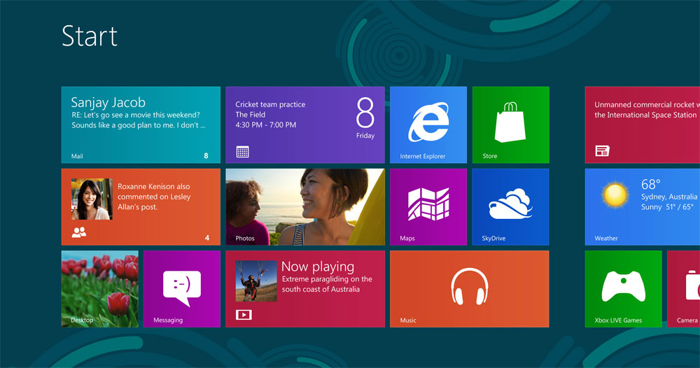
A few years ago, our main concerns as Ottawa web designers was creating sophisticated effects and detail-oriented designs, including complicated animations, shiny, glossy buttons, and heavy textures. Now, the online world is entering yet another phase of maturity: a new era where content is king. The relationship between user and technology has evolved, paving the way for new design trends to emerge. This particular graphic trend has been popular for some time, but recently went mainstream when Windows 8 hit the market. So what is this new design trend?
“Flat Design” and What it Means
Contrary to what it may sound like, “flat design” does not mean boring in any way. Simply put, flat design means a visual presentation with little or no shadows, gradients, shiny objects, or embossing. It is exactly as it sounds; flat, but in a good way. The use of none 3d-style objects is growing in popularity for their simplicity and honesty. Instead of trying to make the web increasingly complex, designers have stepped-back and examined what is really important when creating a website; communicating content to the user. The more detailed a design is, the more distractions there are when presenting content.
Why is Flat Design Popular?
Major companies like Google, Facebook and Microsoft use flat-design techniques in their interfaces because it is “honest”, because what you see is what you get. Content is so important for the user and for ranking in Google, that designers need to focus on presenting clear, concise layouts with easy navigation and accessible information. Flat design techniques rely mostly on layout, colour, and type to minimize the competition between elements and to focus on delivering the content.
What Makes Flat Design Great
- It’s content-focused
- It’s centered on user-experience, meaning your customer will have a more enjoyable time browsing your website
- It also means your website visitors will take in more of your content (meaning more of your message will get across)
- Apps are very popular with mobile users, and flat design is very app-style oriented
- Clear, easy-to-navigate layouts
- Easy to make your site responsive, or mobile-friendly
What do you think of flat design?


