What To Expect For Web Design in 2014
How to Identify a Scam Email
January 27, 2014
Heartbleed Bug and Your Security
April 14, 2014Every year brings new and exciting developments to the world of web design. The way a website is designed today could have a huge impact only 12 months down the road. So how do you avoid falling into the fashion-traps and design faux-pas’? Let’s take a look at how we can differentiate between a modern, long-lasting design, and what is “so 2013”.
What We Will See More of:
Ultra High-resolution Websites
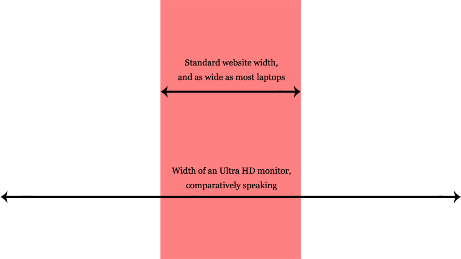
This year at the CES (Consumer Electronics Show), DELL and other companies announced the release of a sub-$1000 Ultra-HD Computer Monitor. What does that mean exactly? Ultra-HD means that monitors can now display resolutions up to 3840 x 2160 pixels. Compare that to the current HD monitors we have now, which go up to a maximum 1920 x 1080 pixels. Sounds like peanuts in comparison, doesn’t it? Now that the prices for these retina-burning machines are a little more sensible, we can expect to see a higher demand for ultra-HD-ready websites.
See the image below for what an 1170 pixel wide website (average size by today’s standards, and as wide as your laptop) looks like on an ultra-HD monitor:
Flat Design Will Continue to Grow
Flat design was probably the biggest trend to emerge in the past year, and we suspect it will continue to evolve.
To many loyal fans’ disapproval and outrage, Apple recently did away with skeuomorphism (the 3D, realistic look) and adopted the Windows 8 flat look in their new operating system, IOS7. Take a look below to see how many of the main app icons changed from the gradient-rich 3D look, to flatter, simple-coloured icons.
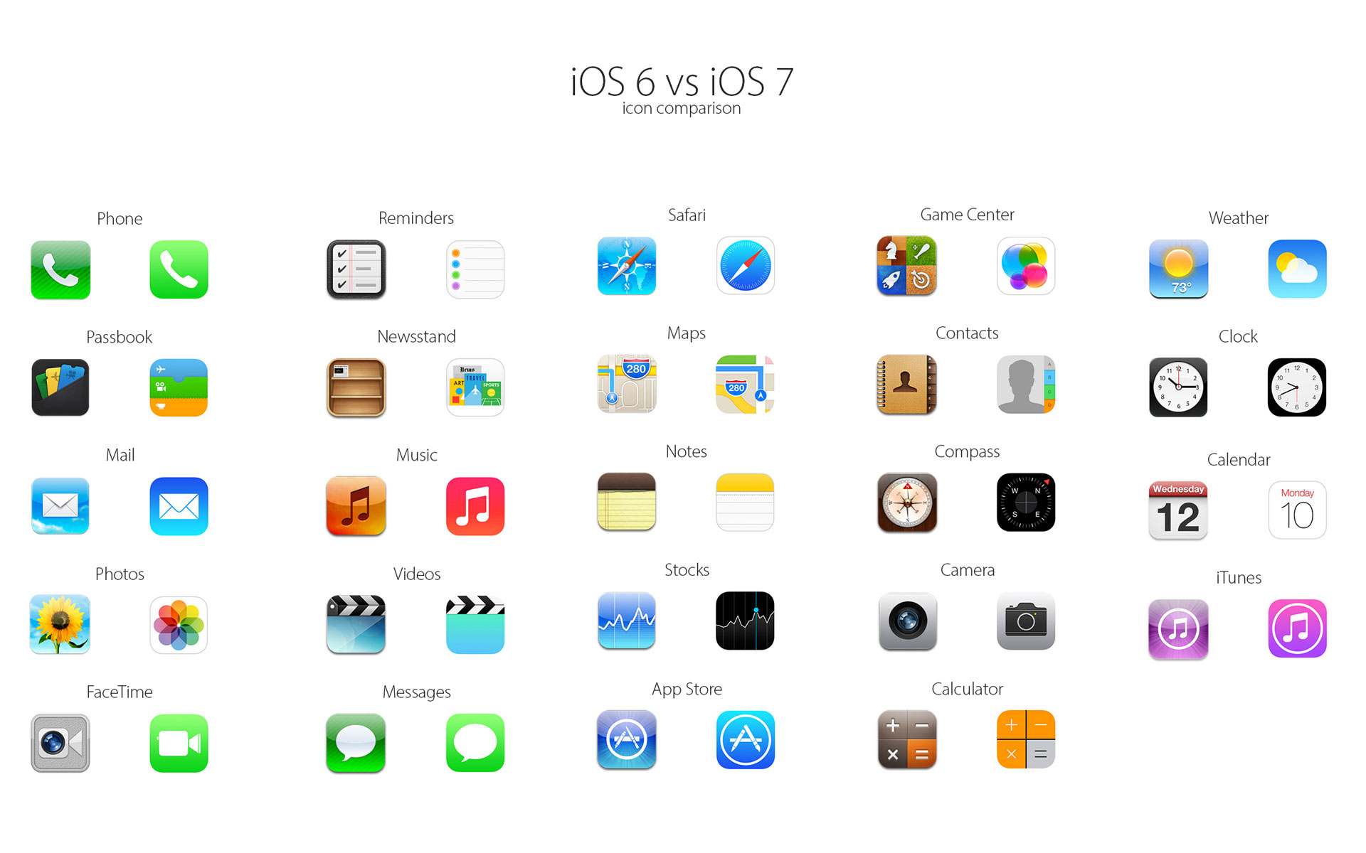
It looks like flat design will be hard to ignore in the coming year.
The return of rich media
With the demise of Flash came the disappearance of fancy animations such as slide-out menus, animated page-transitions, background videos, and more. For a few years, minimalism was in, and overly-animated sites were frowned upon. But, with the emergence of HTML5 and CSS3, animations are making a comeback. Web design, much like fashion, will always be cyclical.
Typography as a Design Element

[via GPS to GO fleet tracking]
A unique font can add a lot of personality to a website. For years now, designers have been experimenting with typography to bring a fresh and creative spin on what could otherwise be a pretty straight-forward project. Sites like Google Fonts allow designers to use a massive library of online fonts without slowing down the user experience. After all, content is king (but there’s nothing wrong with making it pretty!).
Better Photography

[Via Ottawa Region Rewards Association]
Using big, emotional photographs as a design element is a great way to give your website a personal touch. There are many ways to use photography to inspire a viewer, other than placing the odd picture in your content here and there. You can have full-sized background photos, you can use them in headers, or you can even make a nice sharp image the focal point of your design.
Simple Colour Schemes
The monochromatic colour scheme is an emerging trend for a reason. It simply means that instead of using multiple colours to attract the viewer, you use only one colour with its different shades, and black and white accents. This trend emerged mainly as a way to emphasize content, but it also means that the colours will never clash, it’s more elegant, it’s accessible for people with colour-blindness, and more.
More, Bigger, Better Videos
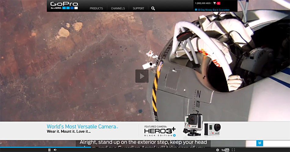
Video is increasingly becoming a primary method of consuming content online – which was evidenced by the growth in popularity of new video-based social networks in 2013 such as Vine and Video for Instragram. So moving into 2014, we can expect to see more use of web videos, but similar to images as mentioned above, we can also expect to see bigger videos what with the larger screen resolutions and all.
Take a look at the homepage for GoPro.com, with a high-resolution, full width video in the background.
What Will Slowly Disappear?
Sliding Banners
While sliding banners are a great design element, and are still very much in use, they could be one of 2014’s first victims. While they display a wealth of visual information that can be entertaining, as well as present the companies’ divisional taglines, it’s possible that they don’t bring any real value to the user. Many new sites are losing the rotating banner look for the big, full-scale background image.
Complicated Forms
As mentioned in our latest post about scam emails, the web is like the wild-west. Travelers tread lightly and carefully, always weary that they are about to fall victim to yet another scam, and we can’t blame them! That’s why users are afraid to fill out overly complex forms that ask a multitude of personal questions. The trend of having multiple long-form surveys for multiple services is now being replaced by one simple, and user-friendly form that won’t alienate potential clients.
Overcomplicated design
When you try to fill in space by adding too many fonts, too may pictures, too many icons, and too may call-to-actions, you’re over-complicating a design. Just because you have more interactive elements on your site, doesn’t mean they are beneficial to the user. We like to keep it light and airy and open, because after all, it’s the content that matters.
(As a designer, I had a hard time writing that last line.)
Bad Stock Photos

This one is quite self-explanatory. Everyone has seen that customer-service representative with the microphone-headphones smiling politely, sitting at her computer ready to help. No one will believe that this is what your customer-service reps actually look like. Stock photos quickly make your website look generic, untrustworthy, and impersonal, which is never good for a brand.
Mobile Only Sites
Mobile-only sites and responsive sites are two different beasts. Have you ever noticed the address bar on your phone changes to m.facebook.com when you visit Facebook from your phone? That means the you’ve been redirected to a mobile only site, a second website specifically designed for phone users. But now, with so many gadgets of all sizes and resolutions available, it’s unrealistic to target one specific platform anymore*. That’s why, in 2013, we saw a major increase in the development of responsive sites, designs that adjust themselves to the size of your screen instead of redirecting you elsewhere.
*It’s worth mentioning that we still see situations where a separate mobile website is a better option than a single responsive website – even if the trend has been leaning towards responsive.
The truth is no one really knows which web design trends will last and which will be extinguished by the passage of time, but we can make educated guesses. In the end, together we decide what makes the web!
Need help with your next website redesign? Get started now!
Thanks for reading,
Nick

