New Website for Oegema, Nicholson & Associates
Facebook Advertising: Forced Upon Us, But it Works
May 26, 2014Google vs. Bing? Which One Are Your Customers Using?
August 5, 2014We are very excited and proud to announce the launch of the brand new website for Oegema Nicholson & Associates – Ottawa’s largest independent insurance broker.
We designed their previous website several years ago, and although that website served them very well for quite some time, we all know that evolution on the web happens all too quickly. And so the time had come for a fresh new look and organization to their website – one which would reflect their brand as it is today – as a leader.
Use the buttons below to view their previous and current website;
| View Previous Website | View New Website |
As you can see, their previous website is still quite nice and has done well for them over the past few years by ranking well in Google and driving leads. But although still satisfactory, the previous website was beginning to fall behind the current times of the web.
So, we wanted to create something truly unique and remarkable for ONA; to reflect their market leadership and full-suite of product offerings. And that’s exactly what we did.
Top 10 Features of the New Website
1) Modern full-width, 100% responsive layout
Now their website can be viewed perfectly on any type of device. With mobile internet use approaching 50% of all internet use, having a mobile friendly website is a surefire must.
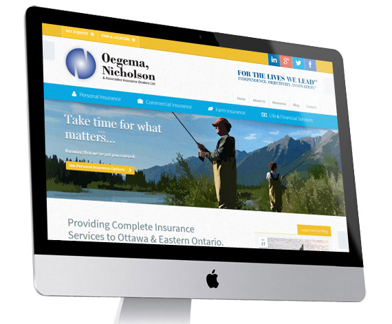
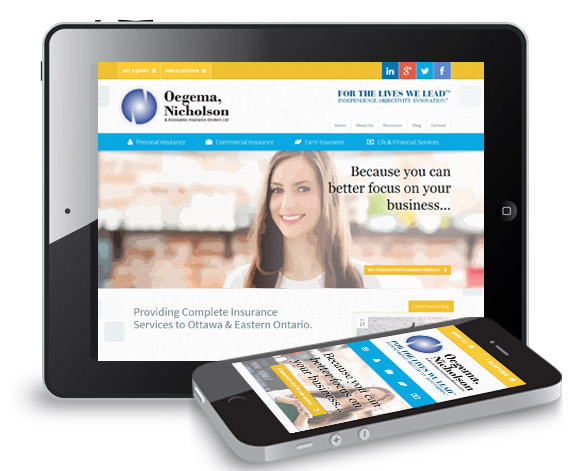
2) New “flat design” to keep up with the latest trends
We took out much of the embossing and bubbly effect of their old website. The new site utilizes the popular web trend of Flat Design while being stylish and complimentary to their branding.
3) Custom-Developed Social Follow Buttons
As ONA is deeply rooted in its community, we also wanted to strengthen the social and blog aspects of the website, as these are the main ways they can connect with their local community online. We even custom developed a new set of rollover social buttons in the top-right of their site, which are something like you’ve never seen before.
Hover over them to try them out for yourself:
[ona_iframe]
4) Sophisticated drop-down menus for quicker access to content
We love big drop down menus that allow you to access content quicker. From their drop-down menus, you can access any page from the website and even select which type of quote you’d like right from within.

5) Unique but subtle canvas textures and watercolour-styled imagery
Since ONA’s current branding features nice watercolour pictures, we incorporated this into the site on a subtle canvas-texture background to really enhance the effect.

6) A newly designed blog feed with big pictures and easy social sharing
The blog itself is optimized for readability and sharing, and features nice big images so as to facilitate more engagement and interest from readers.

7) A strategically optimized for SEO & rankings
The structure of pages on their site is laid out in an optimal way for SEO, and in a way that doesn’t lose any of the Google ranking weight from the old pages of their website. We also performed our site-wide SEO optimization and coded the website for speed and search-engine friendliness.
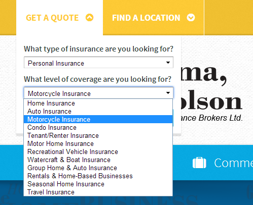 8) Optimized For Conversions
On any given page of the website, there are multiple ways to request a button.
For instance in the top speed bar, there is a quick drop down that lets you choose your category of insurance, and then a specific type of insurance you’re looking for.
It makes requesting a quote all the more convenient and quick for a potential customer – which of course increases the conversion rate of the website.
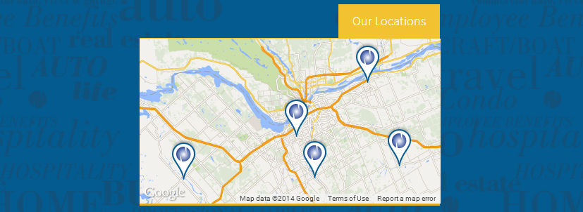
9) Clickable Locations in a Google Map
In the footer of the website is an embedded Google Map that has been customized using their API to allow for custom markers that are clickable – leading to the respective location webpage on the site.
10) Multi-Tiered Homepage
Without going as far as to have a full “one-page scrolling website”, we still wanted to feature a lot of content on the homepage without being too busy. This is a modern feature which is also good for SEO (more content the better). We achieved this by having alternating content areas as you scroll down the homepage, separated by different colour tones. This allowed us the real estate to have some introductory content, more content about them, feature a video as well as a highlighted service, and again, provide a jump-off tool for requested a quote.
Visit the new ONA website here and try it out for yourself!
Interested in a new and effective web design for your business, get started today.
Thanks for reading,
– Ryan


