Google’s Mobile-Friendly Algorithm and What This Means For Responsive Websites
12 Ways to Make Your Website More Modern and Improve Efficiency
December 30, 2014
Why Your Company Website Needs a Blog
October 30, 2015Two years ago, we wrote about making websites mobile-friendly and responsive. Now, providing a great mobile experience for your customers is more important than ever. On April 21st, Google rolled out a new algorithm for mobile searches, which gives more weight to a website’s mobile friendliness.

Websites already had a difficult time being easily found over their competition as it was, and now there’s another factor to anticipate? This post details the motivation behind Google’s new algorithm; what factors are being looked at; provides insight on how responsive website design can work in your favour; and answers whether you’ll be prepared for the change.
Rise of the mobile phone user
Today’s consumers are using the Internet on their mobile devices more than ever, and it was only a matter of time before time spent on mobile internet would outnumber time spent on desktop or fixed internet. That day has come and gone, and with the gap between people doing research on their phones and on their computers becoming almost non-existent, it isn’t hard to see why a mobile friendly website matters.
The reason behind the mobile-friendly algorithm
Since its inception, Google has strived to be the best search engine possible. The company has constantly updated their search algorithm in an effort to better guide users towards exactly what they are looking for. Things are no different today, and with the increased use of mobile, it only makes sense that Google wants to ensure the highest quality results and experience when you need to find something using your phone.
To quote Google themselves:
“When it comes to search on mobile devices, users should get the most relevant and timely results, no matter if the information lives on mobile-friendly web pages or apps. As more people use mobile devices to access the internet, our algorithms have to adapt to these usage patterns. “
This change, although disruptive to the status quo, is meant entirely to improve the experience for users on all devices, and actually offers a lot of opportunity to appeal to your customers.
The importance of mobile user-experience
For many of your potential customers, it’s easier and more convenient to grab their phone and look up your company than it is to boot up a desktop or laptop to do the same. First impressions matter, so you want to make sure your site looks good. When dealing with a screen anywhere between 4 and 7 inches, this can be a lot more difficult than on a full-sized monitor.
All the same concerns that went into your website design in the first place now need to be considered again for someone using a smaller screen — and without the convenience of a mouse and keyboard. Things like resolution, spacing, legibility, and navigation have to all be anticipated for on a device that fits in the palm of your hand.
Ease of navigation and finding what you need

The effectiveness of a website can be measured in how quickly and easily a visitor can find what they’re looking for. Whether you have an e-commerce website, or just want to provide additional information on how you deliver your services, potential customers want to know more about your company… and if they can’t find this quickly, nobody wins.
We’ve all experienced how frustrating it can be to come upon a website on your phone and having to fumble with pinching and squeezing to get the text to just the right size for reading. And after all that, you have to struggle with swiping in all directions to find the next page you ‘re looking for. Often times, this frustrating act can cause a visitor to leave your site entirely.
This is the issue Google intends to eliminate entirely with their newest algorithm. Although the update has caused a lot of panic in the industry, the intentions are good – simply, to make everyone’s lives easier.
If you can make your web site visually stunning, easy to navigate, and all things considered, more appealing, you can leave a great impression on your visitors and differentiate yourself from your competitors.
Is my site responsive?

Now that you know why Google’s pushing for responsive sites, have a look and see how your web site stacks up. Follow the link to access Google’s mobile-friendly test tool, and see if your website is responsive.
If your web site passes, congratulations! You’re prepared!
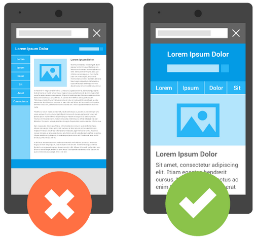
If not, you may encounter the statement “NOT MOBILE-FRIENDLY”, accompanied by comments like “text too small to read”, “links too close together” and “content wider than screen”. Don’t worry; it isn’t the end of the world! There are techniques and guides out there that you can follow to help make your site responsive.
If you’re looking for an Ottawa web design company to help improve your site’s SEO by updating design to make your web site modern and responsive, we would be more than glad to help!
Call us at (613) 829-2229, or request a web design quote today!


