3 Ways Your Contact Form Might Be Killing Your Conversions

Why Your Search Rankings Move Up and Down
November 8, 2016
2017 Web Trends – What Can We Expect?
December 7, 2016Let’s say you’ve got a website that draws a lot of high-quality traffic. You rank well for some relevant keywords, or your AdWords campaign is doing a great job in bringing people to your site that are searching for your important phrases. But for some reason, what should be high quality traffic isn’t converting to leads.

There could be any number of culprits (there’s a whole branch of digital marketing called conversion optimization, devoted to identifying and fixing just this sort of issue.) One of those culprits could be your contact form on your site. Here are a few ways that your form could have you losing out on precious inquiries.
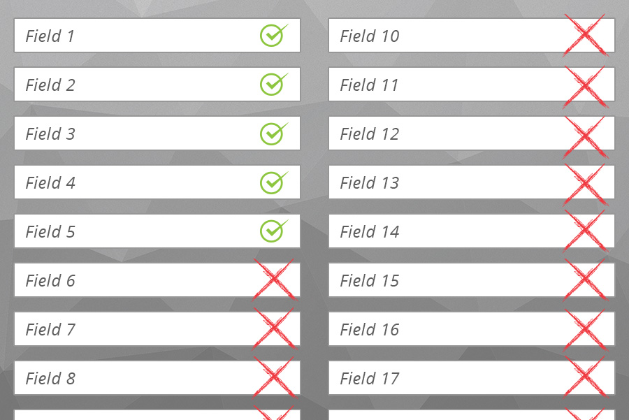
1. Your form is too long.
You have to understand that everyone who might want to make an initial inquiry is not necessarily in a “ready to buy right now” mode. Maybe they’re willing to start the conversation, or get some initial details, and might even turn into a fantastic prospect one day… but just not yet. These people can be easily turned off by a form with too many fields. It’s like asking way-too-personal questions on a first date. If you’re running a dog walking business, do you really need to know the dog’s name and its favourite colour (GREY) to give their owner an estimate? Yeesh. Cool it!
Advice: Get the bare minimum amount of information you need to start your quoting or sales process – you can always get the rest later.
2. Your form is frustrating to use.
People are more and more fickle these days, especially when they’re using mobile devices. Who has the time and energy to pinch and push and mess around with a form that doesn’t fit nicely in their screen? Or worry, “did that form go through or not?” Or (again), “why do they need to know that right now?” Users are just not very forgiving when they’re trying to get something done online. The slightest issue, and they’ll head on back to Google and try the next site.
Advice: Test your form from the perspective of a user, on multiple devices – you might be amazed with the issues you discover.
3. Your form is not placed well on the page.
Don’t underestimate the importance of placement. For many companies, it makes sense to have the form right at the top of a page, or prominently on a sidebar (and by the way, don’t forget to check where your form appears when your site resizes for mobile). For other companies, it might be better to have a little bit of explanation before hitting them with the inquiry form.
Advice: Your form placement can have a major impact on your overall conversion rates, so put careful consideration into where it appears on both desktop and mobile.
Optimizing Forms: Small Changes Add Up
You may be of the mindset that if a person wants to submit an inquiry, they’ll go through with it regardless of any obstacles. More and more, we’re seeing that this isn’t the case. Conversion rates are a matter of percentages, and small adjustments can make a huge difference to your lead generation and your bottom line.
Need a hand? ABORG has a team of digital marketing specialists ready to help you with your conversion optimization. Get in touch today!


