12 Ways to Make Your Website More Modern and Improve Efficiency

ABORG’s Office Move – What Does Business Location and Website Design Have in Common?
November 27, 2014
Google’s Mobile-Friendly Algorithm and What This Means For Responsive Websites
May 8, 2015The online world evolves so fast that sometimes it’s hard to keep up with the latest trends and we forget how effortless it is to fall behind on keeping our website up-to-date. After all, for many of us that are not adept in the “language” of design, it can be an easy thing to overlook – just another item to add to your growing to-do list.

Three to Five Years
Almost everyone of us is accustomed to thinking about purchases or contracts in 3-5 year terms – buying a car on a 5 year plan, locking down your mortgage rate for 5 years, signing a cell-phone contract for 3 years, buying a new computer every 3 years – so why should your website be any different?
Within that span of time, a lot of things happen. For one, your business has probably grown significantly and your branding and messaging might not be reflecting your current vision. Secondly, your website probably looks outdated, but more importantly, it most likely is not as efficient as you think it is. What do I mean by that?
Here is a list of 12 things your 5 year old website is probably not doing:
Using More Whitespace
Whitespace is the amount of room between elements on your site. The more space you have, the better. With the abundance of mobile users in recent years, website designs have become more simple. Complex, over-crowded pages are alienating potential customers, slow to load, and just plain ugly.
Web Fonts
Web fonts have become increasingly popular since the launch of Google webfonts. These fonts allow designers to use an almost-unlimited number of exciting fonts that make your website much more enticing to the consumer.
CSS Animations
Interactive animations are making a come-back, and with more recent and better technology and code, they have become quite common. Not only that, but they don’t bog down your load times like they use to with complex Flash animations. You’ll notice a lot more hover effects, sliding menus, rotating icons and such on modern websites.
Icons
Icons have become synonymous with web design. They are pretty, useful and easily spruce up your website without any effort.
Updated Color Scheme
Can you name or think of the most popular colors in design in recent years? Here’s a hint:

Not exactly what you thought? If your website color scheme is drastically different, maybe it’s time for an update!
Responsiveness
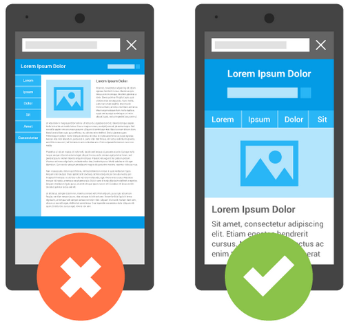
We’ve covered this subject in the past, but that doesn’t make it old news. Nothing is more important than usability when it comes to a website. If potential customers get frustrated visiting your site on mobile devices, they are not likely to revisit in the future. Having a responsive site means that it can scale properly to any device.
Better Browser Support
That being said, if you have a responsive site, you have to make sure that all browsers including Chrome, Firefox and Internet Explorer, are reading it correctly. That is a whole other project in itself. Even if you have a static website, you may still have cross-browser issues, and those should definitely be resolved for the best user experience.
Social Media Sharing
Social media is vastly important because it allows a direct link to brands and their users – it improves brand relations because a user can show their friends and circles how they’re interacting with your company. It gives the user value because they can share something they think is cool with their friends. It makes it easier to share your stories if you’re particularly relevant, which is the best time to engage with potential clients – while you’re relevant. It also adds validity, because it provides a source for where a story comes from. Nothing but good things can come of Social Media Marketing.
Bigger, Better Footers
Most outdated websites use a very small footer area, which does not include much important information. A well organized footer with lots of meta links is a good way to improve your bounce rate, and optimize your site’s usability.
Accessibility
ABORG had a major increase in demand for accessible websites in 2014. Many of our clients are now becoming aware that accessible content is becoming super important (mostly for government organizations, but still recommended for everyone). By Accessibility, we mean the WCAG 2.0 Guidelines, which make it easier for people with disabilities to navigate your site.
Material Design
Here is a new term you probably haven’t heard before. It’s a fancy new name for Flat Design with shadows. Since gaining major traction with the release of Windows 8, Flat Design has already evolved to a new stage – Material Design. According to Google’s designers, keeping the flat look but adding shadows to images and buttons make them stand out from the content, improving your click-through rate. This, however, is a new trend that has yet to be proven long-term. Will 2015 be the year of Material Design?
Professional SEO (Search-Engine Optimization)
SEO is important because it links your website to the things your potential clients are looking for. You can say you’re store XYZ and that you sell 123, but through SEO, you add context to your website, so that if a client is looking for a candy shop in Ottawa, they’ll find you. Many changes have been made in the way Google processes SEO, such as content and keywords, so odds are, if you haven’t updated your SEO in years, you probably need a complete Search Engine Optimization redo!
To check a few, or all of these things off your growing to-do list, contact us today!


